Tag Archives: infographic

How do headphones work? New infographic: Chemistry of BEATS®

Chemistry of BEATS® Headphones jameskennedymonash.wordpress.com
jameskennedymonash.wordpress.com

If you’ve ever tried Beats® headphones, you’ll have felt the rich, powerful baselines they give you without overwhelming the rest of the music. Beats® and its music streaming service, BeatsMusic, have become so popular so fast that they now recently acquired by Apple for a whopping $3 billion, making co-founder Dr Dre the most financially successful hip-hop artist of all time. By far.

Here’s how this best-selling product works. Each headphone contains a neodymium magnet (the strongest known permanent magnet). When an electrical signal from your iPod (or similar) passes through the gold-plated audio cable to the voice coil, electromagnetic induction gives the voice coil a variable magnetic field. The exact strength and timing of the variable magnetic field represent perfectly the music being played. The voice coil’s magnetic field then interacts with the magnetic field of the headphone’s neodymium magnet via magnetic attraction (or repulsion), which moves the diaphragm, which sits between the magnet and the ear. When the diaphragm moves, it creates differences in air pressure (sound waves) that are detected by the diaphragm in your ear.

Excellent sound quality requires an air-tight seal between the headphone’s diaphragm and the diaphragm in your ear. Overstuffed leather guarantees this air-tight fit. Leather requires over 20 treatment processes before it’s ready to use in manufacturing. One of those processes is dying using polyazo dyes. When used in lower concentrations, these dyes are brightly-coloured; when mixed together and used in very high concentrations, they give an overall ‘black’ appearance to the leather.

The Beats® headphone frame is made from strong anodised aluminium. Aluminium, a strong yet lightweight metal perfect for making wearable tech, is anodised to increase its ability to resist wear-and-tear. The aluminium headphone frame is dipped into an electrolytic solution with a ~20-volt direct current flowing through it. Bubbles of hydrogen form at the cathode, and bubbles of oxygen form on the surface of the headphone. This oxygen gas buildup quickly oxidises not only the surface of the headphone, but deep into pores in the surface, which give the frame very high resistance to corrosion. ●

How are Lego® bricks made? The Chemistry of LEGO®

I saw a Greenpeace advertisement recently that lambasted LEGO® for its ongoing toy deals with Shell Corporation. The advertisement was dark, sarcastic, and tasteless.

The video, made to highlight the Danish company’s $130-million relationship with Shell, has reappeared on YouTube after being withdrawn last week following copyright complaints from the toy-maker.

The video made me feel sorry for LEGO®. It also reminded me that LEGO® is made from oil-based products (even though they’re trying to find a sustainable alternative), and it inspired me to make this infographic: the Chemistry of everyone’s favourite building block.

Chemistry of LEGO jameskennedymonash
jameskennedymonash.wordpress.com

LEGO® is made from ABS (acrylonitrile butadiene styrene), a thermoplastic polymer comprised of three monomers. The first monomer, acrylonitrile, gives the bricks strength. The second, 1,3-butadiene, gives them resilience (i.e. stops them from snapping so easily) and the third, styrene, gives them a shiny, hard surface. These three ingredients are mixed with colorants then polymerised (hardened) with the help of an initiator called potassium peroxydisulphate. LEGO® buys pre-made ABS granules and injects them into brick shapes on a massive scale.

LEGO® make 20 billion bricks each year (that’s 35,000 bricks a minute) and according to the Guinness Book of World Records, they produce more plastic tyres than anyone else. Personally, I think that’s a remarkable feat. It’s engineering genius.

In a statement, LEGO® said: “We firmly believe that this matter must be handled between Shell and Greenpeace. We are saddened when the LEGO brand is used as a tool in any dispute between organisations. We will continue to… deliver creative and inspiring LEGO play experiences to children all over the world.”

Why is Gold Yellow? The Chemistry of GOLD

Chemistry of GOLD jameskennedymonash v2
jameskennedymonash.wordpress.com

Why is Gold yellow? Special relativity causes length contractions and time dilations in objects that travel at speeds approaching the speed of light. The valence electrons of large atoms such as gold have such high energies that their speeds actually approach the speed of light—and the relativistic effects on those electrons can become quite large.

Special relativity changes the energy levels of the 5d orbital in a gold atom so that the energy difference between 5d and 6s orbitals equals the energy of a ‘blue’ photon. Gold thus absorbs blue light when electrons are elevated from the 5d to the 6s orbitals, while other metals do not. These special relativistic changes to the energy levels of atomic orbitals are slightly different for each element.

Relativistic contractions on gold’s valence electrons (the 6s subshell) pull the 6s electron very close to the nucleus. Being closer to the nucleus makes the 6s electron less accessible to any potential reactants. Special relativity is not only the reason for gold’s yellow colour but also for its very low reactivity! ●

Visual Ingredients: Head & Shoulders Shampoo

Visual Ingredients - Head and Shoulders Shampoo v2
Click to download large JPEG

What do those ingredients on the back of the shampoo bottle mean?

Head and Shoulders

This graphic might give you some clues. In some cases, I’ve replaced the name on the bottle with a name that’s more commonly-used by chemists on this chart. All ingredients are in the same order as on the bottle—top to bottom, then left to right. Enjoy!

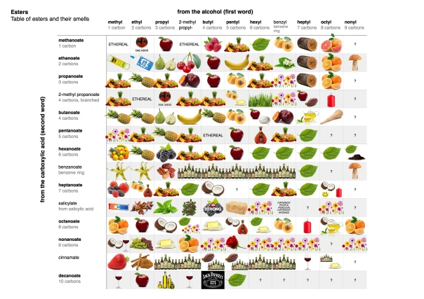
Infographic: Table of Esters and their Smells

Table of Esters and Their Smells

Click to download (1.1Mb JPEG)

I love esters. This infographic is totally self-explanatory to any chemist. (Or email me if you have any questions.) Enjoy! 😉

  • Esters are made by reacting alcohols and carboxylic acids together in a condensation reaction.
  • Different combinations of alcohols and carboxylic acids give rise to different esters, and each ester has a unique aroma.
  • These esters are found naturally in fruits and vegetables and are also used in perfumes.
  • You can now look up an ester in the table above and find its aroma by referring to the picture.
  • Ambiguous or “mixed” smells are indicated by the presence of multiple images in each box.
  • Benzyl salicylate is amazing: some people can perceive it while others can’t. However, people who can’t perceive benzyl salicylate can tell that it alters the overall aroma of perfume to which it’s been added! Magic!
  • You can make any of these relatively safely in the kitchen or at school.
  • All of these esters are edible in minuscule (microgram) amounts and are found naturally in all fruits, vegetables, herbs and spices.
  • That said, though,
      never eat anything you make in the lab!

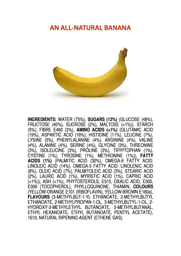
Ingredients of an All-Natural Banana

This visualisation has a short story behind it.

Ingredients of an All-Natural Banana
Click to view large JPEG

I usually care too much about food labels. If something has monosodium glutamate (E621) or high fructose corn syrup (HFCS) in it, I’m probably not going to buy it no matter how healthy or delicious the food looks as a whole. (Strangely, I’d be willing to eat it, though.)

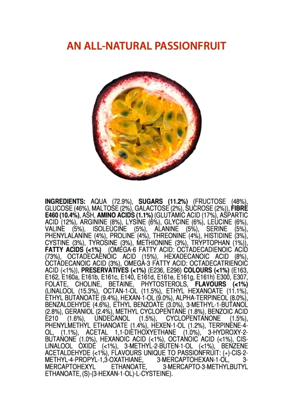
Some people care about different ingredients such as “E-numbers”. I made this graphic to demonstrate how “natural” products (such as a banana) contain scary-looking ingredients as well. All the ingredients on this list are 100% natural in a non-GM banana. None of them are pesticides, fertilisers, insecticides or other contaminants.

There’s a tendency for advertisers to use the words “pure” and “simple” to describe “natural” products when they couldn’t be more wrong. With this diagram, I want to demonstrate that “natural” products are usually more complicated than anything we can create in the lab. For brevity’s sake, I omitted the thousands of minority ingredients found in a banana, including DNA 😉

Enjoy!

Infographic: Chinese ‘Hot’ and ‘Cold’ Foods

This visualisation’s been on my list for a while now: Chinese ‘hot’ and ‘cold’ foods.

Chinese 'hot' and 'cold' foods
Click to download (JPEG)

The Chinese have an ancient way of classifying foods into ‘hot’, ‘warm’, ‘cool’ and ‘cold’ based on how you feel after you eat them. Watermelon is ‘cold’, for example, and chocolate is ‘hot’. It makes sense, really.

I plotted “temperatures” (in a Chinese sense) of common foods against their retail price in Coles supermarket, Australia. The results are really interesting.

It’s a bit cartoony. Feel free to use it as you wish. Enjoy 🙂


Infographic: Defining Bonds as Electronegativity Differences (∆EN)

Electronegativity can be an extremely difficult concept to grasp. Here it is, condensed into a concise, beautiful infographic with all the fundamental information you need to know.

I didn’t sign this one for a change. However, I made it, and as always, you’re all free to use it. Just be kind and let me know! 🙂 Enjoy.

Level: high school/first year university

Electronegativity difference map key
Click to enlarge (2850×1950 JPEG image, 800 kB)

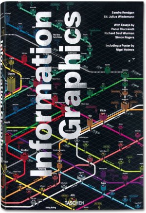
Book: Information Graphics (Taschen)

Information Graphics

Giant trilingual compilation tome of graphics by various international artists.
5.0 kilograms, 

I’m a visual learner and a huge fan of data visualisation. I’m not very good at visualising data by myself (my own efforts are posted here), but I do appreciate the beauty and apparent simplicity of other people’s finished results. The surge in data visualisations we’ve seen in recent years is owed to two things: an overwhelming amount of data made available by the internet; and vast amounts of computing power available to analyse this data in great depth. We can now analyse entire genomes, millions of ‘tweets’, or entire books and their full revision histories relatively quickly to make meaningful conclusions.

All data visualisations can be judged by their beauty, utility and complexity. Very few of the examples in this book hit all three of those targets. The cover image, for example, is beautiful and complicated but useless. The “Earth history” timeline on page 257 is beautiful and useful but too simple. The “So You Need a Typeface” graphic (below) is useful and complex, but its scrambled layout makes it look bland and difficult to read.

photo-4

That said, this is an art book, and I’m not supposed to ‘like’ everything in it. Considering that art’s purpose is to make people think, then this book succeeds spectacularly. It’s multi-lingual (written in English, French, German, Russian and others—and no particular language dominates the book), so I’m left guessing most of its content. I wasn’t even sure how to read this book: the book itself is too large to open up on my desk, doesn’t fit in my bag, doesn’t fit in one hand, is too cumbersome to take outside and would be exhausting to read in bed. Closed, it’s the size of a pillow! Its intended audience probably reads it on giant artists’ drawing tables—I had to read it on the floor.

I didn’t learn much content from this book. There’s no story, no chapters or sections and the whole book lacks organisation. Many of the fonts are illegibly small, and most of the captions are uninformative (or in foreign languages), which implies that I’m actually not supposed to learn anything—just appreciate the pretty aesthetics.

What I did learn, however, was that I had a particular taste in data visualisations—I like them useful, beautiful and complicated. Thankfully, this book’s massive size meant that there were still dozens of graphics (in 500 pages) that I actually really liked. Recommended for fans of graphic design.