Mid-Autumn Festival (中秋节) is a traditional Chinese festival celebrated on the 15th day of the 8th lunar month each year (a full moon night in September). It started as an agricultural tradition (like harvest festival in western cultures) around 1000 BC in the Zhou Dynasty, and was formally acknowledged as a festival during the Northern Song Dynasty (between 960 and 1279 AD).
Today, Mid-Autumn Festival is celebrated with moon cakes, family reunions and three days off work. Moon cakes are circular to represent the full moon that always occurs on the Mid-Autumn Festival. Watch the video below to learn about the story behind the festival:
Moon cakes consist of crust, filling and an egg wash. The crust is made from flour, the polysaccharides in which bind together at oven temperatures to form a strong, intricate network (also including proteins) that allows the moon cake to keep its all-important circular shape.
The crust also contains invert sugar syrup, which is chemically similar to both honey and golden syrup. Invert sugar syrup is made by hydrolysingsucrose into its constituent monomers, glucose and fructose. The result is a sweeter-tasting, gooey liquid that doesn’t crystallise during cooking. This gives the moon cake a smooth mouthfeel.
Peanut oil (a blend of mostly monounsaturated triglycerides) is added to the crust for two reasons. First, it is a non-volatile liquid at room temperature, which prevents the moon cake from drying out. Second, the peanut oil molecules disrupt the protein matrix in the crust and give it an even smoother texture (not a doughy texture).
Maillard reactions are caramelisation reactions involving the removal of two hydrogen atoms from a sugar aldehyde or ketone. The resulting compounds are yellow/brown in colour because they contain carbon-carbon double bonds (C=C), which absorb violet and UV light (λmax ≈ 190 nm). The moon cake is usually also given an egg wash, which provides extra protein necessary for Maillard reactions to occur. More egg wash will provide a deeper brown colour to the dough.
Alkaline water (枧水) is a common ingredient in Guangdong-style cuisine. Chemically, it’s a ~0.020 molar solution of potassium carbonate and can be considered as the ‘opposite of vinegar’. It raises the pH in the moon cake, which accelerates the Maillard reaction, which is favoured by alkaline conditions. Alkaline water thus makes the crust more brown!
Finally, the fillings can be very diverse. Lotus seed with salted duck egg yolks is a common filling, but “five kernels”, red bean and green tea (with beans) are also quite popular. Lotus seed filling, for example, is made by soaking dried lotus seeds in alkaline water, pulverising and adding sugar. The resulting paste is then cooked with more oil and sugar before being used to fill a moon cake. ●
Many people are openly addicted to coffee. In northern Europe, home of the world’s greatest coffee drinkers, annual coffee bean consumption hovers around 9 kg per capita, which equates to 400 mg of caffeine per person per day (this is a highly addictive, highly stimulating dose). In North America, coffee bean consumption is much lower at 4.2 kg per capita per year, which equates to 185 mg of caffeine per person per day. However, this is still a highly addictive dose.
jameskennedymonash.wordpress.com
Caffeine (around 225 mg in the beverage shown above) causes short, sharp increases in your blood pressure. It makes you feel alert, but jittery in large doses. Caffeine stimulates nerves by counteracting adenosine, which is a nerve activity suppressant. The brain develops a tolerance to caffeine intake after a few weeks, which can cause some people to take increasingly large doses—sometimes exceeding the ~300 mg per day limit recommended by many doctors. That said, smaller doses are believed to provide some protection against Parkinson’s Disease in the long term.
Milk, a butterfat emulsion, gives the coffee its light colour and pleasant mouthfeel. Vanilla syrup adds an interesting flavour and aroma, and consists of glucose syrup and vanillin, an artificial flavour compound modelled on the main aroma compound in real vanilla beans.
The most amazing aspect of the product shown is the polypropylene cup. Starbucks® sells these reusable cups for just $1 in its United States stores, which is part of an attempt to serve 5% of all its beverages in reusable containers by 2015. In addition to giving you a 10-cent discount for bringing your own cup, and selling these reusable cups ridiculously cheaply, Starbucks® makes these cups from a fully recyclable plastic that’s completely inert at boiling-hot temperatures (100°C). This ensures that absolutely nothing from the cup leeches into your piping hot drink before you drink it. ●
Inspired by the recent Peach infographic, I set out to find the least natural fruit in existence, and decided it was probably the modern watermelon. Take a look below: which one would you rather eat?
jameskennedymonash.wordpress.com
The watermelon, delicious as it is, has increased from 50 mm to 660 mm in diameter, which represents a 1680-fold increase in volume. While ancient “wild watermelons” weighed no more than 80 grams, modern watermelons can range from 2 kg to 8 kg in the supermarket, while the Guiness World Record for the heaviest watermelon recorded exceeded 121 kilograms in the year 2000. Thousands of years of human-induced evolution have worked miracles on these fruits. Let’s not forget that they’re completely artificial.
The most famous example of artificial selection is of course the selective breeding of the feeble teosinte plant into juicy, delicious, North American sweetcorn.
jameskennedymonash.wordpress.com
In 9000 years, sweetcorn has become 1000 times larger, 3.5 times sweeter, much easier to peel and much easier to grow than its wild ancestor. It no longer resembles the original teosinte plant at all. Around half of this artificial selection happened since the fifteenth century, when European settlers placed new selection pressures on the crop to suit their exotic taste buds.
That’s all for now… More exciting infographics coming soon. Enjoy! 😉
Why is Gold yellow? Special relativity causes length contractions and time dilations in objects that travel at speeds approaching the speed of light. The valence electrons of large atoms such as gold have such high energies that their speeds actually approach the speed of light—and the relativistic effects on those electrons can become quite large.
Special relativity changes the energy levels of the 5d orbital in a gold atom so that the energy difference between 5d and 6s orbitals equals the energy of a ‘blue’ photon. Gold thus absorbs blue light when electrons are elevated from the 5d to the 6s orbitals, while other metals do not. These special relativistic changes to the energy levels of atomic orbitals are slightly different for each element.
Relativistic contractions on gold’s valence electrons (the 6s subshell) pull the 6s electron very close to the nucleus. Being closer to the nucleus makes the 6s electron less accessible to any potential reactants. Special relativity is not only the reason for gold’s yellow colour but also for its very low reactivity! ●
This artificial vs natural foods phenomenon has grown somewhat since the All-Natural Banana.
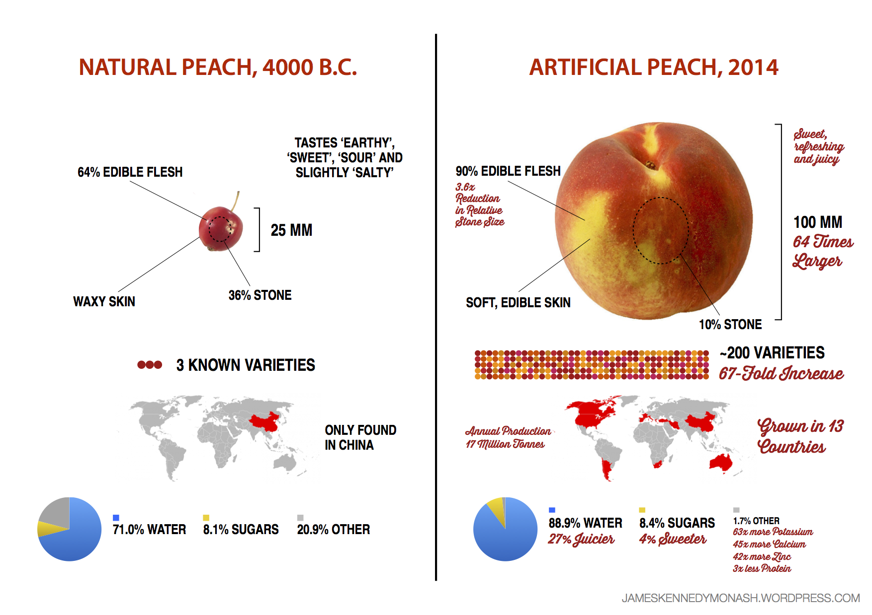
This infographic explores the differences between the natural, “wild peach” and its modern, artificial relative. It explores how the ancient Chinese developed a small, wild fruit (that tasted like a lentil) into the juicy, delicious peaches that we eat today.
This image also pays homage to the thousands of years of toil that farmers put into developing the Peach regardless of whether they were aware of it consciously or not.
After the wild peach was domesticated in 4000 B.C., farmers selected seeds from the tastiest fruits for re-planting. They tended to the trees for thousands of years, and the fruits became bigger and juicier with each generation. After 6000 years of artificial selection, the resulting Peach was 16 times larger, 27% juicier and 4% sweeter than its wild cousin, and had massive increases in nutrients essential for human survival as well.
It’s Australia Day and beetroot burgers are in ‘season’.
Chemically, beetroots are remarkably simple.
The colour in beetroots comes from just two E-numbers (which are each groups of about 10 compounds); and the flavour comes almost entirely from geosimin. So simple.
Inspiration for Meet the Terpenes came from the rhetological fallacies graphic over at Information is Beautiful, while motivation came from a 45°C heat wave this week that prevented any sensible Australians from going outside. So I stayed at home and did this.
Click to download 200dpi JPEG (5.4Mb)
It took about three days to sketch, research and create.
Three days ago, I knew nothing about terpenes. My undergraduate phytochemistry class was really difficult. The teacher was a genius, and put huge amounts of effort into his tutorials, giving us thick booklets at each seminar filled with his hand-written notes and dozens of chemical structures. But for some reason, I just didn’t get it.
So this week, I decided to make the graphic I wish I’d had when I took the phytochemistry class many years ago. Having this poster on my wall would have answered all my questions and made the class much more enjoyable. I hope you find it useful, too.
As always, I welcome all feedback, corrections, suggestions and comments, etc.
A book on how to make simple infographics about boring things 200 pages, ★★
The Power of Infographics is a comprehensive guide on how to turn drab topics like sales and organisation charts into unintentional office comedy. None of this book was intended to be funny—no, it was intended to be useful, but I find the charts in this book are so pointless that they belong with doodles and LOLcats, not in an ‘art’ book.
Here’s one of those pointless charts.
What’s the point of this chart?
This book is written for people with no time to read. All the usual nuances of a corporate book are in here, including short chapters, bullet-lists, repetitive catchphrases (memes) and boring case-studies about how people increased their sales blah blah blah.
Some of the graphics are quite good, which is my rationale for giving it two stars. But the whole book is full of graphics on corporate networking, sales figures, and social media statistics. So very, very dull. Read Information is Beautiful instead. ★★
Thanks to the thorough, kind and extremely useful feedback I’ve received as a result of making this chart, I’ve created a revised edition of the Table of Organic Compounds and their Smells poster with 8 additions and corrections. See details underneath.
Click to download PDF version
Additions
I found a really old botany book that says undecan-2-one smells like “rue wort”. I don’t know what “rue wort” is, but I’ve labelled it on the chart anyway.
Added a 15-carbon row, which includes tamarind, celery and musk smells.
Added a benzene row, which includes almonds, tar and orange smells.
Added methene, CH₂! It’s extremely unstable and is usually called ‘carbene’. Nobody knows what it smells like because it reacts before it reaches your nose.
Corrections
Pentane now has a smell
Alkenes are now labelled ‘unpleasant’
Corrected the second ketone column header from “2-methyl-” to “methyl-“
Moved kumquats to the left.
There were also some minor aesthetic changes: skull & crossbones symbol shows high toxicity (category I or II), while a warning symbol shows moderate toxicity (category III). A green face icon represents a highly unpleasant smell.
Again, thank you to all the people who emailed or otherwise messaged me with feedback on this poster. It pleases me to see how much this poster’s been shared around the internet on many different platforms. I’m glad you find it interesting. 🙂
Yesterday, I uploaded Visual Guide to E-numbers. Today, after I thought it was all finished, I woke up with a completely redesigned version in my head—and couldn’t resist making it and uploading that, too. Here it is: E-xplosion: E-numbers Explained!


 The colour in beetroots comes from just two E-numbers (which are each groups of about 10 compounds); and the flavour comes almost entirely from geosimin. So simple.